Does "the twitter ratio" apply to the #rstats community?
Jan 28, 2018 · 16149 words · 76 minute read
Not long ago I came across a FiveThirtyEight post called “The Worst Tweeter In Politics Isn’t Trump”. Well, it was a long time ago actually, but this project was laying in my computer for a while ¯\(ツ)/¯. They gathered some resources from the media discussing that tweets leading to more replies than likes and retweets are the ones that make the community angry. This phenomenon is known as “The Ratio” as Luke O’Neil wrote recently in Esquire.
FiveThirtyEight used a ternary plot to illustrate the proportion of replies, retweets and likes of every Trump tweet. In this post I'm going to plot tweets with the rstats hashtag, suspecting that the ones that have a higher ratio of replies might be an exception to this rule since conversations tend to be pretty friendly in this community. But let's find out!
Disclaimer
It wasn’t until I had this post ready for publishing that I realized the replies the media were discussing were the direct ones, without considering the replies of the replies, so I just invented a new ratio 😱 I spent a great amount of extra work to consider all the replies (direct and indirect ones) but I liked the way it turned out and the way I had to solve some problems, so I’ll just stick with my personal definition of the ratio, knowing it’s not what it’s supposed to be 💁
Retrieving the data
I'm becoming more and more fan of the rtweet package, built and maintained by Michael W. Kearney. It's the way to go when you want to interact with Twitter's API using R. I fetch some tweets with #rstats to analize!
library(rtweet)
library(dplyr)
tweets_rstats <- search_tweets(q = "#rstats",
                                include_rts = FALSE,
                                n = 300)

tweets_rstats <- tweets_rstats %>%
  distinct()
I keep only the original tweets with at least two likes because I want to keep _relevant_ tweets. This is probably too arbitrary and surely can be improved, but here I go.
orig_tweets <- tweets_rstats %>%
  filter(is.na(reply_to_status_id),
         favorite_count > 1) %>%
  select(status_id, screen_name, text, favorite_count, retweet_count) %>%
  distinct()
I already have the number of retweets and the number of likes of each original tweet, but not the number of replies. To build the ternary plot (or pyramid as I prefer to call it) I need the number of replies as well. As the API doesn't have a direct method to do this, so I have to do it by hand.
Here comes the purrr part. The purrr package is receiving a lot of love this year: there is a group sharing the #purrrResolution, courtesy of Isabella Ghement that you can join:
Just sent out the first group e-mail concerning the #purrrResolution #rstats #purrr - if you haven't received it, it means you are not yet on the list. To join the list, you can e-mail me (isabella@ghement.ca). Keep on purrring!
— Isabella R. Ghement (@IsabellaGhement) January 5, 2018
And Colin Fay created the Twitter collection #RStats — Your daily dose of #purrr with great tips!
I collect all the mentions to all screen_names in the orig_tweets dataframe. I use distinct(screen_names) because I don't want to call the API more than once for every screen_name.
library(purrr)
library(tidyr)

orig_tweets_mentions <- orig_tweets %>%
  distinct(screen_name) %>%
  mutate(query = paste0("@", screen_name, " OR ", "to:", screen_name, " OR ", screen_name)) %>%
  mutate(tweets = pmap(list(q = .$query,
                            n = 1000,
                            retryonratelimit = TRUE),
                       rtweet::search_tweets)) %>%
  select(tweets) %>%
  unnest()
Here I'm joining the conversation by using the pmap function to fetch all the mentions to all the screen_names in the orig_tweets dataframe. The API only returns tweets from the last 6 to 10 days, but it should suffice. As Lucy pointed out in her post about Twitter Trees, querying the API using only to: screen_name misses some tweets, so I took her recommendation of including @screen_name and OR screen_name. You will notice that I took a lot of ideas from her blog post, which I highly recommend if you like to work with Twitter conversations.
I need to apply the rtweet::search_tweets function to each screen_name in the orig_tweets dataframe, passing more than one argument to the function: pmap is the answer! You can pass a list of arguments to the pmap function for it to pass them on to the search_tweets one. In this case I pass q: the query, n: the number of tweets I want, and retryonratelimit: set to TRUE for it to wait and retry when rate limited.
This is what I get:
Getting the chain of replies
Then I'll use another resource from Lucy's genius post to get the chain of replies from a tweet. I create a function that takes the status_id as input, and returns all the replies and the replies of that replies and so on. Again I use purrr to apply the function to all the status_ids from the orig_tweets dataframe, but this time I need to pass only one argument to the function, so I use map instead of pmap.
get_replies_chain <- function(id) {
  diff <- 1
  while (diff != 0) {
    id_next <- orig_tweets_mentions %>%
      filter(reply_to_status_id %in% id) %>%
      pull(status_id)
    id_new <- unique(c(id, id_next))
    diff <- length(id_new) - length(id)
    id <- id_new
  }
  orig_tweets_mentions %>%
    filter(reply_to_status_id %in% id)
}

replies <- orig_tweets %>%
  mutate(replies = purrr::map(.$status_id,
                       get_replies_chain)) %>%
  tidyr::unnest(replies) %>%
  select(status_id, screen_name, text, status_id_reply = status_id1) %>%
  distinct()
The reason I needed the replies is to count them, because in the original tweet I only have the number of retweets and the number of likes, but not the number of replies. The last step is to count the replies!
replies_count <- replies %>%
  group_by(status_id) %>%
  summarise(reply_count = n()) %>%
  ungroup
Building the pyramid
I build a dataframe with the variables I need for the plot. I create the ratio variables that is The Ratio, the proportion of replies to replies + faves (or likes as we call them now), that is our variable of interest.
tweets_tern <- orig_tweets %>%
  left_join(replies_count, by = "status_id") %>%
  mutate(reply_count = coalesce(reply_count, 0L),
         ratio = reply_count / (reply_count + favorite_count)) %>%
  select(screen_name, status_id,
         replies = reply_count,
         RTs = retweet_count,
         faves = favorite_count,
         ratio)
I build a different dataframe containing the mean of `replies`, `RTs` and `faves`, for reference.
tweets_tern_mean <- tweets_tern %>%
  summarize(mean_replies = mean(replies),
            mean_rt      = mean(RTs),
            mean_fave    = mean(faves))
For building the pyramid I use the ggtern package, an extension to the ggplot2 package specifically for the plotting of ternary diagrams. I have to use the lines dataframe for better visualization, and I plot the mean (tweets_tern_mean) bigger.
library(ggtern)
library(viridis)

lines <- data.frame(x = c(1, 0, 0),
                    y = c(0, 1, 0),
                    z = c(0, 0, 1),
                    xend = c(0, 1, 1),
                    yend = c(1, 0, 1),
                    zend = c(1, 1, 0))

pyramid <- ggtern(data = tweets_tern, aes(x = replies, y = RTs, z = faves)) +
  geom_mask() +
  geom_point(col = ifelse(tweets_tern$replies/(tweets_tern$replies + tweets_tern$faves) > .5,
                                viridis(5)[3], viridis(5)[1]),
             alpha = 0.7) +
  geom_point(data = tweets_tern_mean,
             aes(mean_replies, mean_rt, mean_fave),
             color = viridis(5)[1], alpha = 0.8, size = 5) +
  theme_classic() +
  theme(legend.position = "none") +
  geom_segment(data = lines,
               aes(x, y, z,
                   xend = xend, yend = yend, zend = zend),
               color = "grey",
               size = .2) +
  theme_showarrows()

pyramid
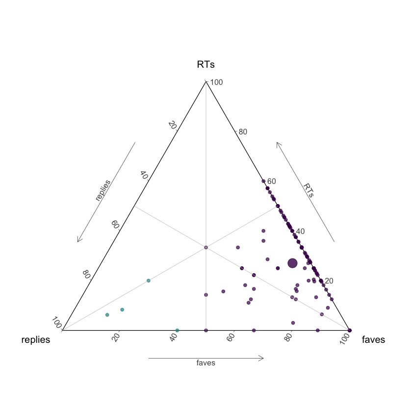
I would have loved to present this ternary plot in an interactive fashion, with a tooltip to see every tweet, but I couldn't find a direct way to do it, so maybe next time I'll figure this out! In the meantime, I decided I could try a different approach to look at these tweets 😎
Apparently there are 4 out of the 123 with more replies than likes, let's explore them!
Building Twitter Trees à la Lucy 👯
As I said, I'm a fan of Lucy's post, so I'll plot the conversations that falls into The Ratio rule in the form of a graph, to explore them as she did (with a few tweaks). Also, I'm a bit obsessed with graphs now that I took James Curley‘s “Network Analysis in R” DataCamp course, which is great! I use igraph, ggraph and ggiraph packages, the last one to make the graphs interactive .
I select the tweets first.
tweets_tern_prop <- tweets_tern %>%
  arrange(desc(ratio)) %>%
  filter(ratio > .5)
then I loop over them to plot each twitter tree. Note that this is an interactive plot, the seed tweet is in a different color, and the size of the point is relative to the likes count.
library("ggraph")
library("igraph")
library("ggiraph")

set.seed(52)

graphs <- list()

for (i in 1:nrow(tweets_tern_prop)) {
  replies_1 <- get_replies_chain(tweets_tern_prop[i,]$status_id) %>%
    distinct(screen_name, text, status_id, reply_to_status_id, favorite_count)

  tweet_0 <- orig_tweets %>%
    filter(status_id == tweets_tern_prop[i,]$status_id) %>%
    select(screen_name, text, favorite_count)

  from_text <- replies_1 %>%
    select(reply_to_status_id) %>%
    left_join(replies_1, c("reply_to_status_id" = "status_id")) %>%
    select(screen_name, text, favorite_count) %>%
    mutate(favorite_count = coalesce(favorite_count, 0L))

  tweet_0 <- paste0(tweet_0$screen_name, ": ", tweet_0$text, "\nLikes: ", tweet_0$favorite_count)

  to_text <- paste0(replies_1$screen_name, ": ", replies_1$text, "\nLikes: ", replies_1$favorite_count)
  to_text <- gsub("'", "`", to_text)
  from_text <- paste0(from_text$screen_name, ": ", from_text$text, "\nLikes: ", from_text$favorite_count)
  from_text <- gsub("'", "`", from_text)

  edges <- tibble::tibble(from = from_text,
                          to = to_text) %>%
    mutate(from = ifelse(from == "NA: NA\nLikes: 0",
                         tweet_0,
                         from))


  graph <- graph_from_data_frame(edges, directed = TRUE)
  V(graph)$tooltip <- V(graph)$name
  V(graph)$tooltip <- gsub("'", "`", V(graph)$tooltip)

  library(stringr)
  V(graph)$size <- str_extract(V(graph)$name, "[0-9*]$")

  p <- ggraph(graph, layout = "nicely") +
    geom_edge_link(edge_colour = viridis(5)[3]) +
    geom_point_interactive(aes(x, y,
                               tooltip = tooltip,
                               size = size),
                           color = ifelse(V(graph)$name == tweet_0, viridis(5)[2], viridis(5)[1]),
                           alpha = 0.8) +
                           # , size = 4)
    scale_size_discrete(range = c(3,12)) +
    theme_void() +
    theme(legend.position = "none")

  graphs[[i]] <- ggiraph(code = print(p),
                     width_svg = 10,
                     zoom_max = 4)
  }
Here are the tweets for us to take a proper look 🎉
First tweet
List columns in the #tidyverse is like data.table syntax for me. No matter how many times I use it I feel like I'm figuring out the syntax for the first time. It just doesn't stick in my brain. #rstats
— Joran Elias (@joranelias) January 26, 2018
Second tweet
Let's play a guessing game.
— Lynn Mazzoleni (@LynnMazzoleni) January 26, 2018
What type of data is in this #Rstats 3d histogram? pic.twitter.com/y2uJwAmTKP
Third tweet
#Rstats community: Any recommendations for introductory @rstudio videos for undergrads on YouTube? Many thanks.
— Dante Scala (@Graniteprof) January 26, 2018
Fourth tweet
Here's a quick #rstats ggraph snippet for the weekend. I can't decide which Star Wars 🎬 to watch again. It technically fits in a tweet but doesn't look great. (Sorry for the earlier broken tweets)https://t.co/HwF0rp6EIa pic.twitter.com/5ngLsVXdfT
— Austin Wehrwein (@awhstin) January 26, 2018
A tweet about graphs, how timely 😃
Poeople doesn't seem angry at all in these replies, they look more like friendly conversations, just as I suspected 😎
Let´s not forget that I'm analyzing my personal definition of the ratio, not the real ratio that was discussed on the media. But anyway: #rstats rocks! 🤘