Visualizing R-Ladies' growth!
May 15, 2017 · 238 words · 2 minute read
I recently came across an article in which they map 5,000 years of city growth in a beautiful animation, and I knew I had to make a similar map for the R-Ladies’ chapters (probably the purple color they use had plenty to do with that 💜 ). So my idea was to map all the R-Ladies’ chapters according to their size, and that's when I thought of using their Twitter followers as a way to estimate it, since it's the most extended social media we use (except for some chapters).
I decided to make 3 posts to go through the details of what I've done (especially for future me!):
- How to fetch Twitter users with R: the title is kind of self explanatory…
- How to deal with ggplotly huge maps: where I go through the details of why I chose not to use
ggplotlyand useplot_geoinstead to generate the HTML. - How to plot animated maps with gganimate: again, pretty obvious subject.
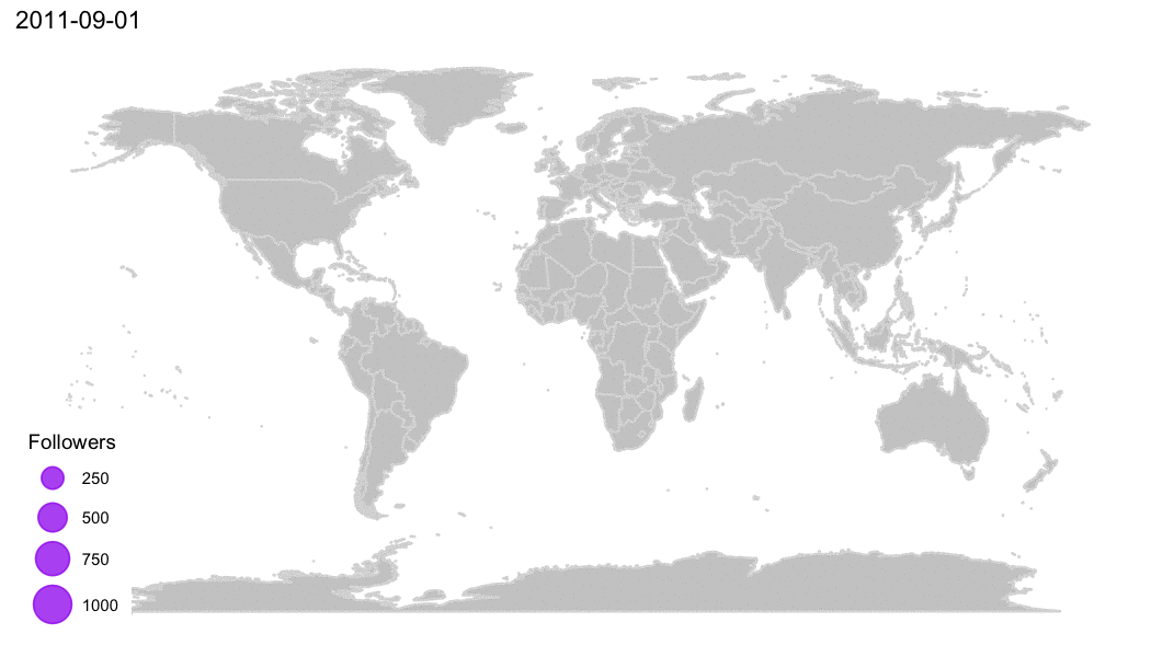
This is the visualization I liked the most, so I wanted to share it here…
… as I did on Twitter, Slack and other social media 💜
New #rstats post! Visualizing #RLadies growth 💜 Step-by-step from Twitter users to #plotly and #gganimate https://t.co/Jgi82Xb4X0 pic.twitter.com/5qkxQwJKQF
— Daniela Vázquez (@d4tagirl) May 15, 2017
It was a pretty popular Tweet, you should try!
Please leave your comments if you have any, or mention me on Twitter. Thanks 😉