How to plot animated maps with gganimate
May 15, 2017 · 1666 words · 8 minute read
This map was built using gganimate v0.1.1. It breaks with the latest version.
This is the third one of the 3-posts-series, where I go from fetching Twitter users and preparing the data to visualizing it (If I wanted to show everything I've done in a single post, it would be almost as long as my first one! And believe me: nobody wants that 😝 ):
- How to fetch Twitter users with R: the title is kind of self explanatory…
- How to deal with ggplotly huge maps: where I go through the details of why I chose not to use
ggplotlyand useplot_geoinstead to generate the HTML. - How to plot animated maps with gganimate: this one. Again, pretty obvious subject.
Finally I present my favourite visualization here.
The data
Let's take a look at the R-Ladies’ chapters’ Twitter accounts dataframe, rladies, I produced in the first post of this series:
library(readr)
library(dplyr)

url_csv <- 'https://raw.githubusercontent.com/d4tagirl/R-Ladies-growth-maps/master/rladies.csv'
rladies <- read_csv(url(url_csv)) %>%
  select(-1)

library(DT)

datatable(rladies, rownames = FALSE,
          options = list(pageLength = 5))
Plotting the map using ggplot2
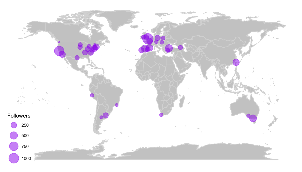
The goal is to produce a map where each chapter is plotted according to its location, with the point's size indicating the amount of Twitter followers.
I use the maps package to get the world map, using the ggplot2::ggplot and ggthemes::theme_map functions for plotting it nicely. Then I plot the chapters choosing the purple color, obviously!
library(ggplot2)
library(maps)
library(ggthemes)

world <- ggplot() +
  borders("world", colour = "gray85", fill = "gray80") +
  theme_map()

map <- world +
  geom_point(aes(x = lon, y = lat, size = followers),
             data = rladies,
             colour = 'purple', alpha = .5) +
  scale_size_continuous(range = c(1, 8),
                        breaks = c(250, 500, 750, 1000)) +
  labs(size = 'Followers')

The range parameter is what controls the scale of the points’ size.
Animating the map using gganimate
Now let's animate the map! The core thing here is that I want every chapter appearing following the creation timeline, to somehow tell a story with the map. Lets start by animating map: the ggplot object I just created. I have to make a few changes for gganimate to work:
-
gganimaterequires aframeaesthetic: I'll use thecreated_atvariable. You set this as a new aesthetic inggplotwhich is ignored by it (as shown in the warning messages), butgganimaterecognizes and uses it; -
I also add the
cumulative = TRUE, an additional aesthetic (same comment aboutggplotignoring it), so once the chapter appears on the map, it keeps showing in all the following frames.
Following my good friend Bruno‘s suggestion, I add an empty frame at the beginning so that the first frame you see is just the empty map. I generate a dataframe with the same structure than the original one, with some random data, except for the created_at field that should be filled with a date prior to the first chapter creation for it to appear at the beginning.
And I add some empty frames at the end as well, to be able to see the final composition of chapters for a bit longer.
library(tibble)
library(lubridate)

ghost_points_ini <- tibble(
  created_at = as.Date('2011-09-01'),
  followers = 0, lon = 0, lat = 0)

ghost_points_fin <- tibble(
  created_at = seq(as.Date('2017-05-16'),
                   as.Date('2017-05-30'),
                   by = 'days'),
  followers = 0, lon = 0, lat = 0)
Then I add 2 extra layers to the ggplot: the second and third geom_points, with the alpha parameter set to 0 so the points will not show in the plot.
map <- world +
  geom_point(aes(x = lon, y = lat, size = followers,
                 frame = created_at,
                 cumulative = TRUE),
             data = rladies, colour = 'purple', alpha = .5) +
  geom_point(aes(x = lon, y = lat, size = followers, # this is the init transparent frame
                 frame = created_at,
                 cumulative = TRUE),
             data = ghost_points_ini, alpha = 0) +
  geom_point(aes(x = lon, y = lat, size = followers, # this is the final transparent frames
                 frame = created_at,
                 cumulative = TRUE),
             data = ghost_points_fin, alpha = 0) +
  scale_size_continuous(range = c(1, 8), breaks = c(250, 500, 750, 1000)) +
  labs(size = 'Followers')

library(gganimate)
ani.options(interval = 0.2)
gganimate(map)

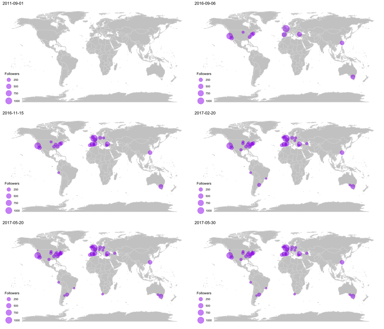
This animation is so cool! It shows how R-Ladies is spreading all over the globe, giving also some idea of how it is growing: where in the world the chapters concentrates and how it accelerated its growing significantly in the last year or so!
Customizing the animation
Now it's when I start to get a little obsessed about some details… You can always improve things, right? 😉
Adding additional frames
This idea actually came from my husband, who suggested that each point could start small when the chapter is founded and reach its full size today. How cool would that be?!
I only have each chapter once in the rladies dataframe, with the creation date and the amount of followers. To create new frames for the gganimate, I have to replicate each chapter with an intermediate number of followers (I assume linear growth) for each intermediate date. I do that by creating a dataframe of dates from the first R-Ladies’ chapter was created until today (to make this analysis reproducible I assume today is 2017-05-15), and keep only the dates 1, 10 and 20 of each month (I could keep all dates but It would not improve the animation's quality much and it would generate a heavier animation).
dates <- as_tibble(seq(floor_date(as.Date(min(rladies$created_at)),
                                  unit = "month"),
                       as.Date('2017-05-15'),
                       by = 'days')) %>%
  filter(day(value) %in% c(1, 10, 20))
Then I generate a new dataframe with every chapter appearing once for every intermediate date, from its creation date until today. I assume the number of followers increasing linearly. (If you are familiar with tidiverse maybe you prefer to skip the next part where I explain how I join these tables).
library(tidyr)

rladies_frames <- rladies %>%
  select(screen_name) %>%
  expand(screen_name, date = dates$value) %>%
  right_join(rladies, by = 'screen_name') %>%
  filter(date > created_at) %>%
  mutate(age_total = as.numeric(age_days, units = 'days'),
         age_at_date = as.numeric(difftime(date, created_at, unit = 'days'),
                                  units = 'days'),
         est_followers = ((followers - 1) / age_total) * age_at_date)
Step-by-step what I do is take the original rladies dataframe and select the screen_name column. With the tidyr::expand I create one row for every screen_name-date combination (Cartesian product). The right_join completes the rest of the information for every chapter, and then I keep only the dates for every chapter that are greater than its creation date (I don't want to have frames for a chapter previous to its foundation!). At last I add some variables useful to estimate the amount of followers (est_followers), assuming the amount of followers increases linearly.
ghost_points_ini <-  ghost_points_ini %>%
  mutate(date = created_at,
         est_followers = 0)

ghost_points_fin <-  ghost_points_fin %>%
  expand(date = created_at, rladies) %>%
  select(date, est_followers = followers, lon, lat)

map_frames <- world +
  geom_point(aes(x = lon, y = lat, size = est_followers,
                 frame = date),
             data = rladies_frames, colour = 'purple', alpha = .5) +
  geom_point(aes(x = lon, y = lat, size = est_followers,
                 frame = date),
             data = ghost_points_ini, alpha = 0) +
  geom_point(aes(x = lon, y = lat, size = est_followers,
                 frame = date),
             data = ghost_points_fin, colour = 'purple', alpha = .5) +
  scale_size_continuous(range = c(1, 8), breaks = c(250, 500, 750, 1000)) +
  labs(size = 'Followers')

ani.options(interval = .05)
gganimate(map_frames)

This is a very accurate map in terms of the timeline: it shows how long it took for every chapter to be founded and how R-Ladies proliferated in the past year or so.
But… (I told you I got kind of obsessed 🤷🏻
♀️ ) it takes too long from the creation of the first chapters until it started to get traction and the last part of the animation is really fast in comparison. So let's take care of that 😉
Removing some frames from the beginning
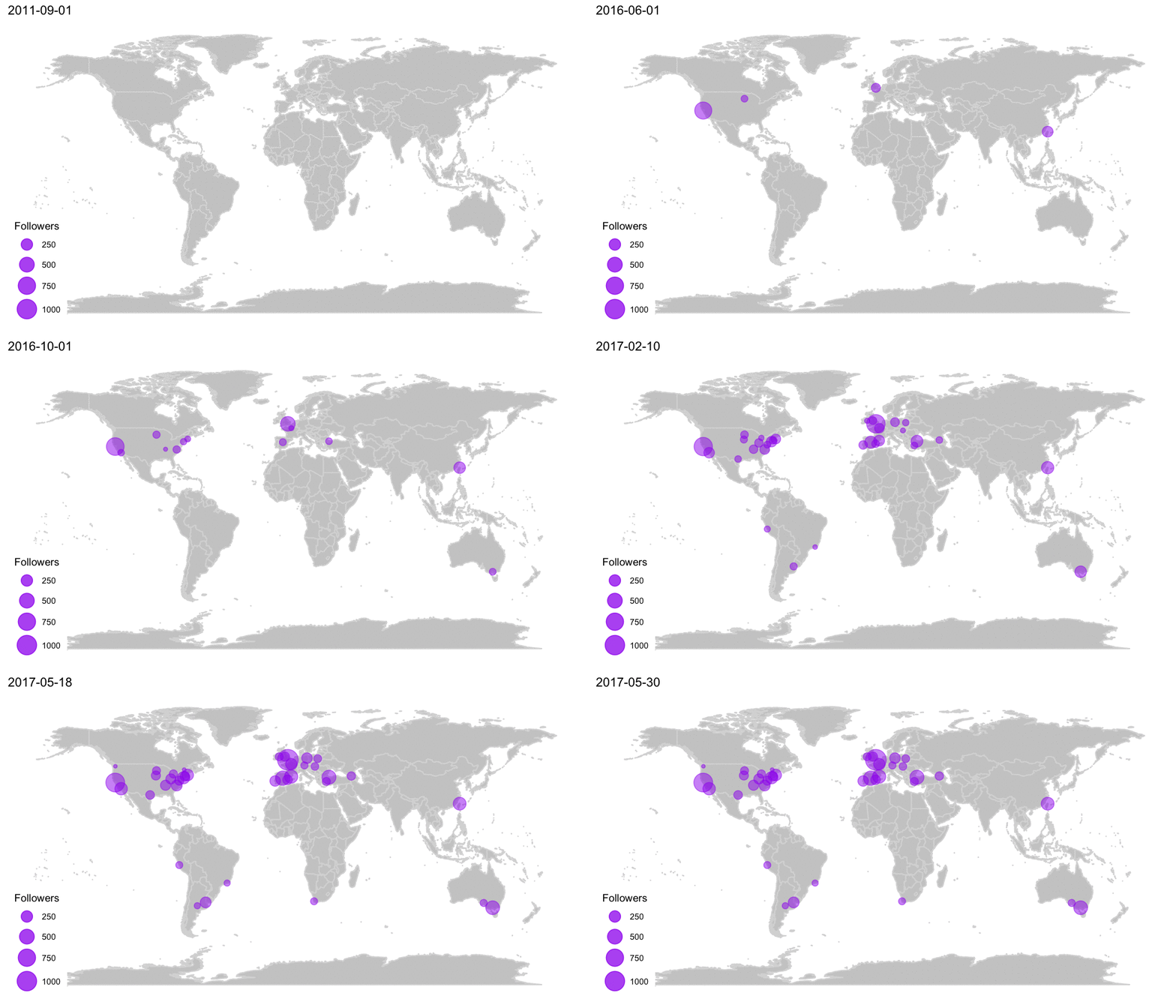
The foundation of the London chapter was kind of a turning point: after that, R-Ladies started to spread much faster. So I decided to keep all frames after that date, but remove several frames from before, keeping only the first day of the month, every 6 months.
rladies_less_frames <- rladies_frames %>%
  filter((day(date) == 1 & month(date) %% 6 == 0) |
           date >= rladies$created_at[rladies$screen_name == 'RLadiesLondon'])

map_less_frames <- world +
  geom_point(aes(x = lon, y = lat, size = est_followers,
                 frame = date),
             data = rladies_less_frames, colour = 'purple', alpha = .5) +
  geom_point(aes(x = lon, y = lat, size = est_followers,
                 frame = date),
             data = ghost_points_ini, alpha = 0) +
  geom_point(aes(x = lon, y = lat, size = est_followers,
                 frame = date),
             data = ghost_points_fin, colour = 'purple', alpha = .5) +
  scale_size_continuous(range = c(1, 8), breaks = c(250, 500, 750, 1000)) +
  labs(size = 'Followers')

ani.options(interval = .15)
gganimate(map_less_frames)

This reduces a lot the amount of frames, at the cost of making the story less accurate in terms of time scale. But it is a nicer animation! My favorite actually 😊
Creating the .gif
The only thing left is to save the animation to a file, in this case I choose a .gif, but you can also choose to save it as .mp4, .swf or .html (each of them requiring specific drivers, check the documentation here)
gganimate(map_less_frames, interval = .2, filename = 'rladies.gif')
I wanted a .gif file to share it on Twitter, Slack and other social media, so I could post something like this:
New #rstats post! Visualizing #RLadies growth 💜 Step-by-step from Twitter users to #plotly and #gganimate https://t.co/Jgi82Xb4X0 pic.twitter.com/5qkxQwJKQF
— Daniela Vázquez (@d4tagirl) May 15, 2017
It was a pretty popular Tweet, so you should try!
That's it! You can check out the code in my GitHub repo here. Please leave your comments if you have any, or mention me on Twitter. Thanks for reading 😉