How to deal with ggplotly huge maps
May 15, 2017 · 1409 words · 7 minute read
This is the second one of the 3-posts-series, where I go from fetching Twitter users and preparing the data to visualizing it (If I wanted to show everything I've done in a single post, it would be almost as long as my first one! And believe me: nobody wants that 😝 ):
- How to fetch Twitter users with R: the title is kind of self explanatory…
- How to deal with ggplotly huge maps: this one, where I go through the details of why I chose not to use
ggplotlyand useplot_geoinstead to generate the HTML. - How to plot animated maps with gganimate: again, pretty obvious subject.
Finally I present my favourite visualization here.
Motivation
For this series I've been experimenting with interactive maps and animated ones these past few days and I finally was able to produce some fancy outputs using the plotly package and the gganimate one. You can see the whole process in my GitHub repo. Everything was working perfectly on RStudio, until I wanted to share my results on my blog, and things got complicated. Originally I produced some interactive maps using the plotly::ggplotly function and it generated a 3.3 MB HTML… and that's an issue when you want to include it on a website 😳 . So I tried a different approach: using the plotly::plot_geo function I was able to produce a very similar plot, generating a way smaller HTML.
The data
I'm using the data produced in this previous post. Let's take a look at it to see what we are dealing with.
library(readr)
library(dplyr)

url_csv <- 'https://raw.githubusercontent.com/d4tagirl/R-Ladies-growth-maps/master/rladies.csv'
rladies <- read_csv(url(url_csv)) %>%
  select(-1)

library(DT)
datatable(rladies, rownames = FALSE,
          options = list(pageLength = 5))
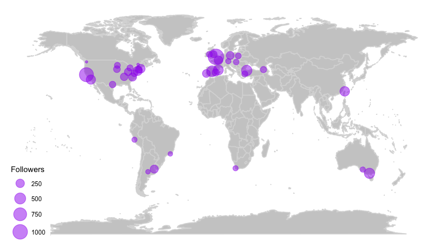
This dataframe is about R-Ladies’ chapters’ Twitter accounts. I want to produce a plotly map where I can plot each chapter according to its location (lon and lat), with each point's size indicating its number of followers.
Using ggplotly
The first thing I did was generate the map using ggplot2, because plotly integrates easily with it with the ggplotly function. And I'm so comfortable using the tidyverse, that it was the natural thing for me to do!
ggplotly translates the ggplot2 object into a plotly one, displaying the aesthetic mappings in the tooltip. As I wanted to include other variables in it, I added the extra (and unofficial) text aesthetic for ggplotly to include them. As ggplot2 doesn't have a text aesthetic it ignores it, but ggplotly recognizes it and displays it in the tooltip.
The greatest thing about the text aesthetic is that you can include more than one variable outside the ggplot aesthetics to display, as shown below.
library(ggplot2)
library(maps)
library(ggthemes)

world <- ggplot() +
  borders("world", colour = "gray85", fill = "gray80") +
  theme_map()

map <- world +
  geom_point(aes(x = lon, y = lat,
                 text = paste('city: ', location,
                              '<br /> created : ', created_at),
                 size = followers),
             data = rladies, colour = 'purple', alpha = .5) +
  scale_size_continuous(range = c(1, 8), breaks = c(250, 500, 750, 1000)) +
  labs(size = 'Followers')

This is the static map that I'm animating using ggplotly, with the following code:
library(plotly)

ggplotly(map, tooltip = c('text', 'size'))
If you want to see this map you can check it out here, but it will take a while! It is a 3.3 MB page (1.2 MB gzipped)!
It's a pretty nice map (and super easy to produce!), but it takes forever to load the HTML! And that is why I checked how the plotly people make this kind of plots from scratch, and I gave it a try.
It is actually pretty easy! The only thing that was not that straightforward for me was finding the chart references for customizing the maps (probably because I was doing a bad job at searching for them 😳 ), so here is the link, and for the layout in particular here it is this other link just in case you encounter the same difficulties as I did.
g <- list(showframe = FALSE,
          coastlinecolor = toRGB("white"),
          showland = TRUE,
          landcolor = toRGB("gray80"),
          showcountries = TRUE,
          countrycolor = toRGB("white"),
          countrywidth = 0.2,
          projection = list(type = 'Mercator'))

plot_geo(rladies,
         marker = list(color = toRGB("purple"),
                       opacity = 0.5,
                       line = list(color = toRGB("purple"),
                                   width = 1.5))) %>%
  add_markers(x = ~lon,
              y = ~lat,
              sizes = c(1, 450),
              size = ~followers,
              hoverinfo = "text",
              text = ~paste('city: ', location,
                            '<br /> created: ', created_at,
                            '<br /> followers: ', followers)) %>%
  layout(geo = g)
This code produces a 16.2 KB HTML, so there I had a 99.5% reduction 🎉
If you had a different experience, please let me know! You can comment below or mention me on Twitter.
And, if you enjoyed this article, check out the next one of the series here! or the code in my GitHub repo. Thank you for reading 😉