Using Rpart to figure out who voted for Trump
Jan 23, 2017 · 3481 words · 17 minute read
It's been a few days since we witnessed the inauguration of Donald Trump as the 45th President of the United States, whose victory over Hillary Clinton came as a shock for most people. I'm not much into politics (and it is not even my country!) but this result really caught my attention, so I wanted to dig a little about the population's characteristics that made him the winner of the Election.
I've been studying Machine Learning for a while now, and a couple of months ago I discovered the awesome tidyverse world (I can't believe the way I used to do things :$), so I thought this was a great opportunity to test my skills. In addition to that, I'm not a native English speaker so in this first post I am facing major challenges! If you see something improvable, not clear or plainly wrong, please leave a comment or mention me on Twitter.
What I do here is estimate a Classification Tree (CART) to find an association between the winner in the county and its socio-demographic characteristics.
The data
I recently joined Kaggle, and Joel Wilson gathered data about 2016 US Election Results by county and County Quick Facts from the US Census Bureau. This is the data I use to run this analysis.
I start by loading the data and merging it. No mystery here, except I load it using readr and merge it using dplyr (yay!).
library(readr)
library(dplyr)

url_pop <- 'https://github.com/d4tagirl/TrumpVsClintonCountiesRpart/raw/master/data/county_facts.csv'
url_results <- 'https://github.com/d4tagirl/TrumpVsClintonCountiesRpart/raw/master/data/US_County_Level_Presidential_Results_12-16.csv'
pop <- read_csv(url(url_pop))
results <- read_csv(url(url_results))

votes <- results %>%
  inner_join(pop, by = c("combined_fips" = "fips"))
It is a clean dataset, but I need to do some modifications for the analysis:
- There is no election data for the state of Alaska so I remove those counties.
- Replace the old ID (
X1) with a new one (ID). - Delete non relevant variables.
- Rename variables to make them interpretable.
All of this taking advantage of the dplyr of course.
votes <- votes %>%
  filter(state_abbr != "AK") %>%
  mutate(ID = rank(X1)) %>%
  select(-X1, -POP010210, -PST040210, -NES010213, -WTN220207) %>%
  rename(age18minus = AGE295214, age5minus = AGE135214, age65plus = AGE775214,
    american_indian = RHI325214, asian = RHI425214, asian_Firms = SBO215207,
    black = RHI225214, black_firms = SBO315207, building_permits = BPS030214,
    density = POP060210, edu_batchelors = EDU685213, edu_highschool = EDU635213,
    firms_num = SBO001207, foreign = POP645213, hisp_latin = RHI725214,
    hispanic_firms = SBO415207, home_owners_rate = HSG445213, households = HSD410213,
    housing_Units = HSG010214, housing_units_multistruct = HSG096213, income = INC910213,
    land_area = LND110210, living_same_house_12m = POP715213, manuf_ship = MAN450207,
    Med_house_income = INC110213, Med_val_own_occup = HSG495213, native_haw = RHI525214,
    native_firms = SBO115207, nonenglish = POP815213, pacific_isl_firms = SBO515207,
    pers_per_household = HSD310213, pop_change = PST120214, pop2014 = PST045214,
    poverty = PVY020213, priv_nofarm_employ = BZA110213, priv_nonfarm_employ_change = BZA115213,
    priv_nonfarm_estab = BZA010213, retail_sales = RTN130207, retail_sales_percap = RTN131207,
    sales_accomod_food = AFN120207, sex_f = SEX255214, travel_time_commute = LFE305213,
    two_races_plus = RHI625214, veterans = VET605213, white = RHI125214, white_alone = RHI825214,
    women_firms = SBO015207,
    Trump = per_gop_2016, Clinton = per_dem_2016, Romney = per_gop_2012, Obama = per_dem_2012)
Most of these variables are measured as a percentage of people in the county with that characteristic (e.g. edu_batchelors and black), or the total amount in the county (e.g. land_area and firms_num).
Note that there is a white variable and a white_alone variable. This is because there are 2 separate facts gathered here.
-
whiterefers to race: people having origins in any of the original peoples of Europe, the Middle East, or North Africa. If a person declares white among other races, is classified astwo_races_plusand not aswhite. -
white_alonerefers to white race people who also reported not Hispanic or Latino origin.
For further references on any variable you can go to the Census Bureau's site.
Building the Response Variable
I create the variable I want to explain: pref_cand_T. It takes the value 1 if Trump has a greater percentage of votes than Clinton in the county, and 0 otherwise. Note that it is not necessary that one of them has more than 50% of the votes, it's only required that has more votes than the other.
votes <- votes %>% mutate(pref_cand_T = factor(ifelse(Trump > Clinton, 1, 0)))

summary <- votes %>% summarize(Trump       = sum(pref_cand_T == 1),
                               Clinton     = n() - Trump,
                               Trump_per   = mean(pref_cand_T == 1),
                               Clinton_per = 1 - Trump_per)

library(knitr)
knitr::kable(summary, align = 'l')
| Trump | Clinton | Trump_per | Clinton_per |
|---|---|---|---|
| 2624 | 488 | 0.8431877 | 0.1568123 |
Trump got more votes than Clinton in 2624 counties opposing the 488 other counties where Clinton got more votes (remember we are talking about counties and not Electoral College votes). The proportion is 84% for Trump and 16% for Clinton.
Some visualization about race and origin
I explore briefly some counties’ characteristics about race and origin by visualizing them. It is time to test my brand new ggplot skills!
I generate a plot for the mean of each characteristic across all counties, which is the mean of the proportion of people with each characteristic in all counties (simple mean, without considering the population of the county).
library(tidyr)
library(ggplot2)

# Order in x-axis
limits = c("white", "white_alone", "black", "asian", "hisp_latin", "foreign")

total <- votes %>%
  summarize(
    white       = mean(white),
    white_alone = mean(white_alone),
    black       = mean(black),
    asian       = mean(asian),
    hisp_latin  = mean(hisp_latin),
    foreign     = mean(foreign)) %>%
  gather(variable, value) %>%
  ggplot() +
  geom_bar(aes(x = variable, y = value),
           stat = 'identity', width = .7, fill = "#C9C9C9") +
  geom_vline(xintercept = c(4.5, 5.5), alpha = 0.2 ) +
  scale_x_discrete(limits = limits) +
  labs(title = "Mean of % in counties",
       subtitle = "(Simple mean of % in counties without considering counties' population)") +
  theme_bw() +
  theme(axis.title.x = element_blank(), axis.title.y = element_blank(),
        axis.text.x = element_blank(), axis.line = element_line(colour = "grey"),
        panel.grid.major = element_blank(), panel.border = element_blank())
Something beautiful about tidyverse is the way that you can build up the solution. The first part is simply dplyr plus tidyr::gather, necessary to manipulate the input for the ggplot. The rest is the ggplot layer by layer.
It seems like a lot of code for a simple plot, but trust me: once you get the hang of ggplot, it is magic! The only fear is that you'll want to customize everything! (An that's why I have so much code…)
Then I generate the same plot by candidate.
by_candidate <- votes %>%
  group_by(pref_cand_T) %>%
  summarize(
    white       = mean(white),
    white_alone = mean(white_alone),
    black       = mean(black),
    asian       = mean(asian),
    hisp_latin  = mean(hisp_latin),
    foreign     = mean(foreign)) %>%
  gather(variable, value, -pref_cand_T) %>%
  ggplot() +
  geom_bar(aes(x = variable, y = value, fill = pref_cand_T),
           stat = 'identity', position = 'dodge') +
  geom_vline(xintercept = c(4.5, 5.5), alpha = 0.2 ) +
  scale_fill_manual(values = alpha(c("blue", "red")),
                    breaks = c("0", "1"), labels = c("Clinton", "Trump")) +
  scale_x_discrete(limits = limits) +
  labs(fill = "winner") +
  theme_bw() +
  theme(axis.title.x = element_blank(), axis.title.y = element_blank(),
        axis.line = element_line(colour = "grey"), legend.position = "bottom",
        panel.grid.major = element_blank(), panel.border = element_blank())
Same as before, but excluding the grouping variable pref_cand_T from the gathering to generate the ggplot input.
Next I plot both. I use the gridExtra package to display both plots together. (And yes, it was a lot of learning this past few months!).
library(gridExtra)

grid.arrange(total, by_candidate, nrow = 2)

Among races, the mean of white people is higher for the counties where Trump won than the rest, and for the counties where Clinton won, the mean of black and asian people is higher. Clinton also won in counties with higher mean of Hispanic or Latin origin people, and foreign-born population.
In a future post I will be doing some more digging into this variables to find out more.
The Classification Tree
As a standard practice, I split the data into train and test samples. I use 70% of the counties for training and the rest for testing. Since I am dealing with unbalanced data, I use the createDataPartition function in the caret package that conserves the proportion of classes across all samples.
library(caret)

perc_train <- 0.7
set.seed(3333)

trainIndex <- createDataPartition(y = votes$pref_cand_T, p = perc_train,
                                  list = FALSE, times = 1)

train <- votes %>% subset(ID %in% trainIndex)
test <-  votes %>% setdiff(train)
Growing the tree
I estimate the tree using rpart, excluding variables non relevant for modelling, and those used to build the response variable.
library(rpart)

pref_cand_rpart <- rpart(pref_cand_T ~ .,
                         data = train[, -c(1:24, 70)],
                         control = rpart.control(xval = 10, cp = 0.0001))
This algorithm grows a tree from a root that has all the observations, splitting binarily to reduce the impurity of its nodes, until some stopping rule is met. I set up this rules with the rpart.control:
minsplit = 20is the default, the minimum of observations in a node to attempt a split.minbucket = 7is also the default, the minimum of observations in any terminal node.cp = 0.0001is the minimum factor of decreasing lack of fit for a split to be attempted.
This is quite a big tree because I use a very small cp (I'm not showing it for that reason, but you can find it here). Simpler trees are preferred, since they are less likely to overfit the data.
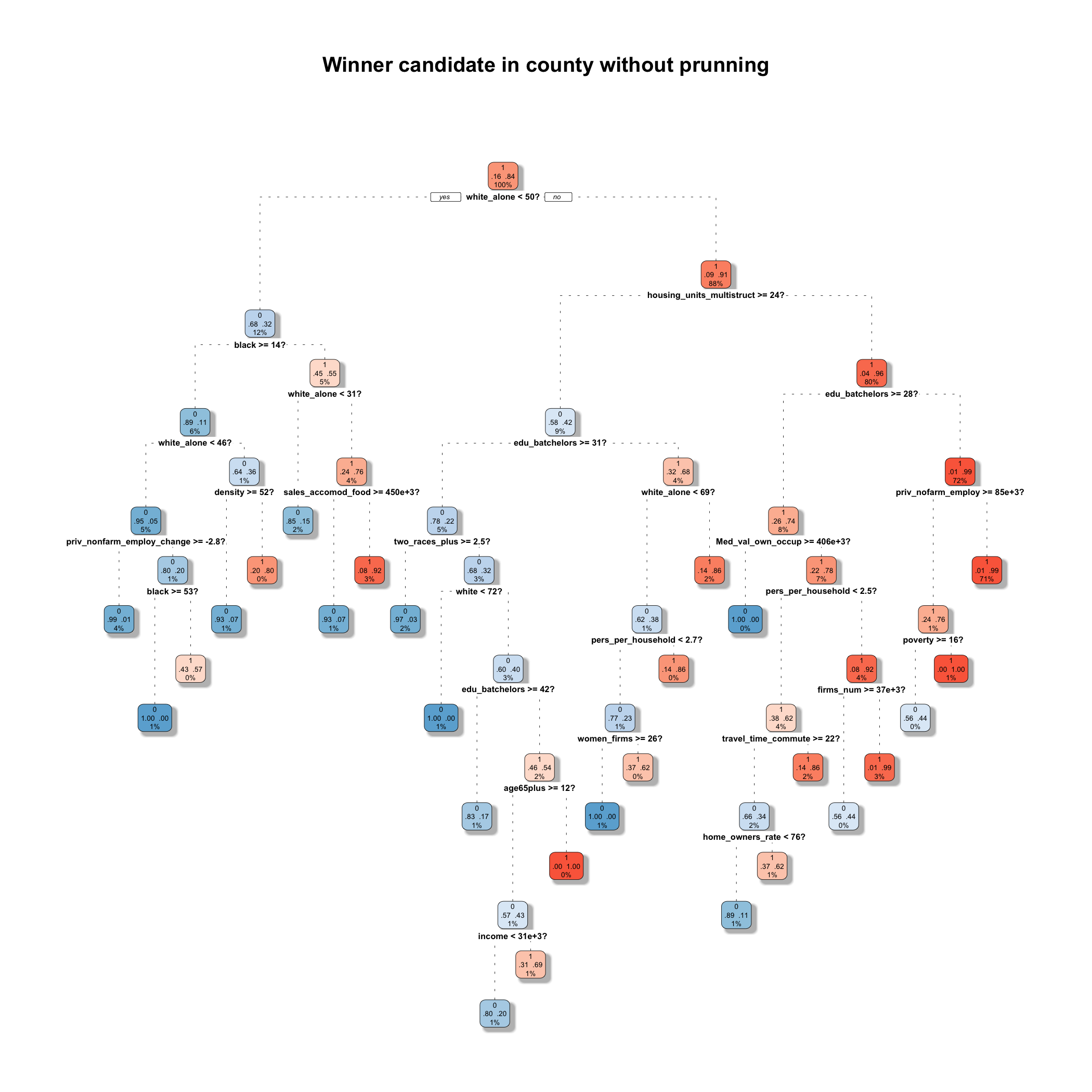
Pruning the tree
Now it's time to prune the tree. To do this, I keep the split if it meets some criteria about the balance between the impurity reduction (cost) and the increase of size (complexity). This is the cp.
I am pruning the tree following the 1-SE rule, according to which I choose the simplest model with accuracy similar to the best model.
library(tibble)
cp <- as_tibble(pref_cand_rpart$cptable) %>%
  filter(xerror <= min(xerror) + xstd) %>%
  filter(xerror == max(xerror)) %>%
  select(CP) %>%
  unlist()

winner_rpart <- prune(pref_cand_rpart, cp = cp)
dplyr manipulates dataframes, so I use the tibble::as_tibble function to convert the pref_cand_rpart$cptable table to a tibble, and then select the cp.
And here I have the tree! (If you know some other way to plot nicer trees, please comment!)
library(rpart.plot)

rpart.plot(winner_rpart, main = "Winner candidate in county",
           extra = 104, split.suffix = "%?", branch = 1,
           fallen.leaves = FALSE, box.palette = "BuRd",
           branch.lty = 3, split.cex = 1.2,
           shadow.col = "gray", shadow.offset = 0.2)

Starting from the top (the root), the tree splits the population in two subsets according to the question asked (the variable and the cut), and it does the same for every node. If the county meets the criteria it is classified to the left, and otherwise to the right. In this case the first split indicates that if the county has less than 50% white_alone population, it is classified to the left node (only 12% of the counties), and the rest goes to the right (80% of the counties). The higher the percentage of counties that Trump won in the node, the redder the node. Nodes associated with Clinton are bluer.
Apparently race is one of the most important characteristic determining the winner candidate. 3 over the 5 splits include race (we will know more about this when we check the Variable Importance later on). And there is also a variable referring the housing structure and other about education.
One key feature of CART is that it allows different characteristics to be relevant for each node resulted from a split. In this case, for counties with less than 50% white_alone population, the winner was also determined by the amount of housing units in multi-unit structures (maybe an urbanization's proxy?) and the percentage of 25 years old or older persons holding a Bachelor's degree or higher. But for the rest of the counties, it was determined by other racial characteristics. This is because the algorithm partitions the feature space in two using linear parallel to the axis decision boundaries, and for each generated region does the same, over and over.
This can be revealing, uncovering underlying interactions of variables for different groups, harder to discover using other methods.
Performance Evaluation
Now I evaluate how good this model is. Prior to this post I wouldn't pay any extra attention to the usage of different measures taking into account how unbalanced the data was. There are a lot of measures to evaluate the fit, I will explore some of them prioritizing the ones that explicitly deal with unbalanced classes.
This evaluations should always be done over the test sample, otherwise it would be like cheating!
Missclassification Error
One classic way to evaluate the performance of a classifier is by calculating the missclassification error, simply by computing the percentage of times that the the classifier is wrong.
test <- test %>%
  mutate(pred = predict(winner_rpart, type = "class", test),
         pred_prob_T = predict(winner_rpart, type = "prob", test)[,2],
         error = ifelse(pred != pref_cand_T, 1, 0))

missc_error <- test %>% summarize(missc_error = mean(error))
knitr::kable(missc_error, align = 'l')
| missc_error |
|---|
| 0.0782422 |
But since I've been doing my research, it has become clear that in this case I could not treat this measure without further considerations.
Let's suppose I have a model that predicts for all cases Trump as the winner. It would have a missclassification error of 15%, not so bad! But it is definitely not a great model: it would be 100% accurate for predicting counties where Trump won, but it would be wrong for all of the counties where Clinton won. This is known as the Accuracy Paradox, and that is why we need some alternatives to measure how good is this tree in predicting the county's winner.
Kappa statistic
One good thing to do in any case (balanced the data or not) is to take a look at the confusion matrix. This is the input for many performance measures as shown next.
test %>%
  select(pred, pref_cand_T) %>%
  table() %>%
  confusionMatrix()
## Confusion Matrix and Statistics
##
##     pref_cand_T
## pred   0   1
##    0  87  14
##    1  59 773
##
##                Accuracy : 0.9218
##                  95% CI : (0.9026, 0.9382)
##     No Information Rate : 0.8435
##     P-Value [Acc > NIR] : 6.196e-13
##
##                   Kappa : 0.6611
##  Mcnemar's Test P-Value : 2.607e-07
##
##             Sensitivity : 0.59589
##             Specificity : 0.98221
##          Pos Pred Value : 0.86139
##          Neg Pred Value : 0.92909
##              Prevalence : 0.15648
##          Detection Rate : 0.09325
##    Detection Prevalence : 0.10825
##       Balanced Accuracy : 0.78905
##
##        'Positive' Class : 0
##
Just looking into this matrix we can have some clues on how good is the classifier for each class. Particularly I want to look closer at the Kappa statistic, because it specifically considers the unbalance between classes.
Kappa measures the accuracy of the classifier corrected by the probability of agreement by chance. There is not much consensus on the magnitude of Kappa to consider it low or high, but it can be interpreted as how separate it is the obtained result from chance. In this case the expected accuracy (the one that occurs by chance) is 77% and the perfect accuracy is of course 100%. There is a gap of 23%, and this classifier closes this gap by 66% of it (15% of improvement!). The higher the Kappa, the better. Some sustain that a value of Kappa larger than 60% means a good agreement, so we are OK!
ROC Curve and AUROC
To complement the performance evaluation, I check the ROC curve. It plots the True Positive Rate against the False Positive Rate across many different thresholds of predicted probability. As we are evaluating a tree with only 6 final nodes, there is a limited amount of thresholds. (Trying to simplify this explanation, I came across this video that is very clear if you want to go deeper)
This measure is great for classification analysis, and it is particularly useful here because it is not affected by unbalanced classes. Luckily I came across this great ggplot2 extension, plotROC, and now I can use my favorite tools to create a pretty nice plot!
library(plotROC)

roc <- test %>%
  select(pref_cand_T, pred_prob_T) %>%
  mutate(pref_cand_T = as.numeric(pref_cand_T) - 1,
         pref_cand_T.str = c("Clinton", "Trump")[pref_cand_T + 1]) %>%
  ggplot(aes(d = pref_cand_T, m = pred_prob_T)) +
  geom_roc(labels = FALSE)

roc +
style_roc(theme = theme_bw, xlab = "False Positive Rate", ylab = "True Positive Rate") +
theme(panel.grid.major = element_blank(), panel.border = element_blank(),
      axis.line = element_line(colour = "grey")) +
ggtitle("ROC Curve for winner_rpart classifier") +
annotate("text", x = .75, y = .25,
         label = paste("AUROC =", round(calc_auc(roc)$AUC, 2)))

The AUROC (Area Under the ROC curve) computes the probability that the classifier ranks higher a positive instance than a negative one.
Warning about Classification Trees instability
When you use this kind of Machine Learning algorithm you should be aware that small changes in the data can change the tree. Find below a second tree generated by using the same parameters than before, but changing the seed to do the sampling.
set.seed(4444)

trainIndex_2 <- createDataPartition(y = votes$pref_cand_T, p = perc_train,
                                    list = FALSE, times = 1)

train_2 <- votes %>% subset(ID %in% trainIndex_2)
test_2 <-  votes %>% setdiff(train_2)

winner_rpart_2 <- rpart(pref_cand_T ~ .,
                         data = train_2[, -c(1:24, 70)],
                         control = rpart.control(xval = 10, cp = cp))

rpart.plot(winner_rpart_2, main = "Winner candidate in county",
           extra = 104, split.suffix = "%?", branch = 1,
           fallen.leaves = FALSE, box.palette = "BuRd",
           branch.lty = 3, split.cex = 1.2,
           shadow.col = "gray", shadow.offset = 0.2)

Although it is not completely different, it changes a bit.
You can fight this using some ensemble method such as Bagging, Random Forest or Boosting, but as I'm particularly interested in easily visualizing the decision rules and potentially finding different patterns for different groups, I find this method a better fit for this particular problem.
Since this algorithm is very sensitive to the train and test partition, I'm interested in having an estimation of the accuracy for this kind of specification of the tree and not only for the specific one I found. This can be achieved by the K-fold Cross-Validation.
K-fold Cross Validation for model accuracy estimation
This method divides randomly the data into k equally sized subsets called folds. A tree is estimated in k-1 of them and the performance is evaluated in the fold left behind. This is made k times, until each fold is used for validation exactly one time.
This was a non a straightforward thing for me to do. I wanted the caret package to calculate the K-fold Cross Validation accuracy estimation, but apparently most people use caret::train to find the parameter cp at the same time. I just wanted to estimate the accuracy associated with an already specified model (I've already estimated the cp). Finally I found the way, specifying tuneGrid = expand.grid(cp = cp).
tc <- trainControl("cv", number = 10)
rpart.grid <- expand.grid(cp = cp)
train.rpart <- train(pref_cand_T ~ .,
                     data = votes[,-c(1:24, 70)], method = "rpart",
                     trControl = tc,  tuneGrid = rpart.grid)

knitr::kable(train.rpart$results, align = "l")
| cp | Accuracy | Kappa | AccuracySD | KappaSD |
|---|---|---|---|---|
| 0.0380117 | 0.9222377 | 0.6869 | 0.0111048 | 0.0525811 |
The Kappa statistic is now 0.69 (it was also 0.66 for the winner_rpart), with a 0.05 standard deviation. Again: good results!
Variable Importance
One last thing to check is the Variable Importance. CART is a greedy algorithm, meaning that it chooses the best split at each node without any consideration of the potential benefit on the overall tree performance of choosing a different one. This way it is possible to end up with a tree with some apparently relevant variables missing.
The Variable Importance in rpart is calculated not only taking into account the goodness of the split for variables that are actually in the tree, but also for the surrogate variables (the variables used in case the main variable is missing for an observation). We can see next that there are many more variables than in the original tree.
winner_rpart$variable.importance %>%
  data_frame(variable = names(.), importance = .) %>%
  mutate(importance = importance / sum(importance)) %>%
  top_n(20) %>%
  ggplot(aes(x = importance,
             y = reorder(variable, importance))) +
  geom_point() +
  labs(title = "Importance of county characteristics \n in determining the most voted candidate",
       subtitle = "(20 most relevant, Rpart, scaled to sum 1)") +
  theme_bw() +
  theme(axis.title.y = element_blank(),
        plot.title = element_text(hjust = 0.5),
        plot.subtitle = element_text(hjust = 0.5),
        axis.line = element_line(colour = "grey"),
        panel.grid.major = element_blank(), panel.border = element_blank()) +
  geom_segment(aes(x = -Inf, y = reorder(variable, importance),
                   xend = importance, yend = reorder(variable, importance)),
               size = 0.2)

The most relevant characteristic is white_alone, the percentage of white population with no Hispanic or Latin origin. In the top 7 almost every characteristic is about race or origin, so it is probably one of the key aspects to study if we want to understand this phenomenon (no surprises here).
What now?
This was my first approach to the subject, I am already doing some extra analysis on the race phenomenon, so I'll be probably posting more on this soon.
If you made it until here: thank you! I tried to keep it simple and intuitive, covering all relevant aspects when estimating this kind of models. The R Markdown I used to generate this post is available here.
If you see room for improvement or simply want to share something, please let me know by leaving your comments here or mentioning me on Twitter :)